From Feed to Cart: Designing Product Images That Convert on Instagram, TikTok, and Pinterest
Social commerce demands punchy, high-contrast imagery designed to stop the thumb scroll in crowded social media discovery feeds.
IndustryPublished February 28, 20269 min readBy the Reframe Visuals editors
The Feed is Not Your Website
The fundamental mistake most brands make with social commerce: they repurpose their website product images for social media. A clean product-on-white image that converts beautifully on a storefront PDP performs terribly in an Instagram feed. Why?
Scaling catalog editing without adding full-time payroll overhead?
Partner with Reframe Visuals: elastic capacity processing 2,500+ commercial images daily, two-editor QA, and 12h–72h turnaround. Test our studio with 3 free sample edits — zero credit card required.
Because the feed is a competitive attention environment. On your website, the customer has already decided to look at your product. In the feed, you're competing with friends, memes, news, and a hundred other brands for a fraction of a second of attention.
Social commerce images must be designed for a fundamentally different psychological context: interruption, not examination.
Platform-Specific Visual Strategies
Instagram Shopping
- Aspect Ratio: 4:5 (1080x1350px) fills the most screen real estate
- Style: Lifestyle-first. Show the product in aspirational context.
- Color: High saturation, warm tones. Instagram's algorithm favors visually engaging images.
- Text: Minimal to none on the image itself. Let the caption do the talking.
- Carousel: Use 3-5 slides to tell a product story (lifestyle → detail → features → CTA)
TikTok Shop
- Aspect Ratio: 9:16 vertical (1080x1920px) for full-screen impact
- Style: Authentic, user-generated aesthetic. Overly polished images feel "ad-like" and get scrolled past.
- Motion: Static images underperform. Even a simple "Ken Burns" pan/zoom effect on a product image outperforms static by 40%.
- Human Element: Products held, worn, or demonstrated by a person convert 3x better than product-only shots.
- Aspect Ratio: 2:3 (1000x1500px) for maximum pin height
- Style: Editorial and aspirational. Pinterest users are "planning future purchases."
- Text Overlay: Works well on Pinterest (unlike Instagram). Feature the product name and key benefit.
- Color: Bright, warm images outperform dark and moody by 20% in click-through.
| Platform | Best Ratio | Style | Human Element | Text OK? |
|---|---|---|---|---|
| 4:5 | Lifestyle/aspirational | Helpful | Minimal | |
| TikTok | 9:16 | Authentic/raw | Essential | Bold/large |
| 2:3 | Editorial/planned | Optional | Yes | |
| 1:1 | Product-focused | Helpful | Yes |
The "Thumb Stop" Anatomy
Every social commerce image needs to pass the Thumb Stop Test: would a user scrolling at full speed pause on this image?
The three elements that create thumb stops:
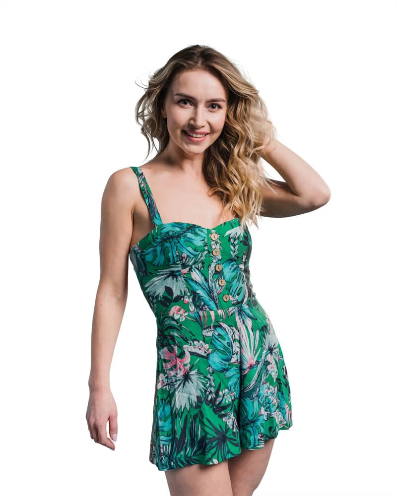
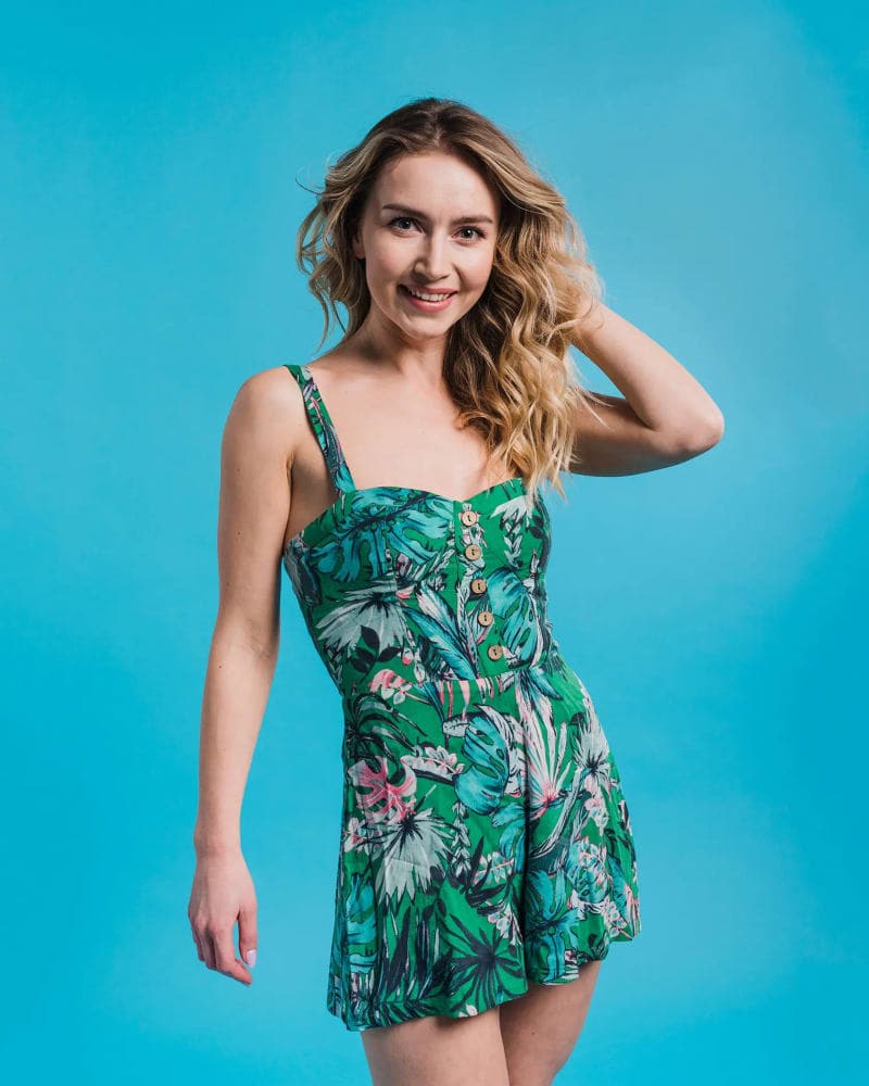
Contrast Pop: The product must stand out from whatever surrounds it in the feed. Professional Background Removal with strategic re-placement on a bold or contextual background creates maximum visual separation.
Human Magnet: The human brain is hardwired to notice faces and hands. Images with people consistently outperform product-only shots in feed environments.
Color Disruption: If the typical feed is blue/grey tones, a warm orange product image disrupts the pattern. Professional Color Correction can strategically adjust your product's presentation to pop in the feed environment.
The "Studio to Social" Pipeline
The most efficient approach isn't shooting twice-it's shooting once and adapting. Here's the pipeline:
- Studio Capture: Clean, professional product photography on white or grey background
- Professional Extraction: Clipping Path and Background Removal for transparent product cutouts
- Web Delivery: Product on white for marketplace and website use
- Social Adaptation: Same extracted product placed into platform-specific lifestyle composites, sized for each channel's optimal aspect ratio
This pipeline delivers 3-4x more content from a single shoot investment. The studio shot serves your marketplace. The composite serves your feed. Same product, different stories.
The Shoppable Content Formula
For Instagram and TikTok Shop, the most effective content formula is:
Frame 1 (0-1 second): The "hook"-a visually striking product moment that stops the scroll Frame 2 (1-3 seconds): The "reveal"-show the product in use or demonstrate its key feature Frame 3 (3-5 seconds): The "proof"-detail close-up showing quality, texture, or craftsmanship Frame 4 (5+ seconds): The "action"-clear visual or text CTA directing to shop
Even for static carousel posts, this 4-frame story structure maximizes engagement and click-through to the product page.
- Feed ≠ Website. Design for interruption, not examination.
- Each platform speaks differently. Respect the visual language.
- Shoot once, adapt many. The studio-to-social pipeline maximizes ROI.
Your product page converts browsers. Your feed creates them. Both matter equally.
Get an exact price for your images.
Tell us your volume and the edits you need. We reply with a price, and you can send sample images to make it exact.